7 Kitchen Design Tips from Michelle Cook
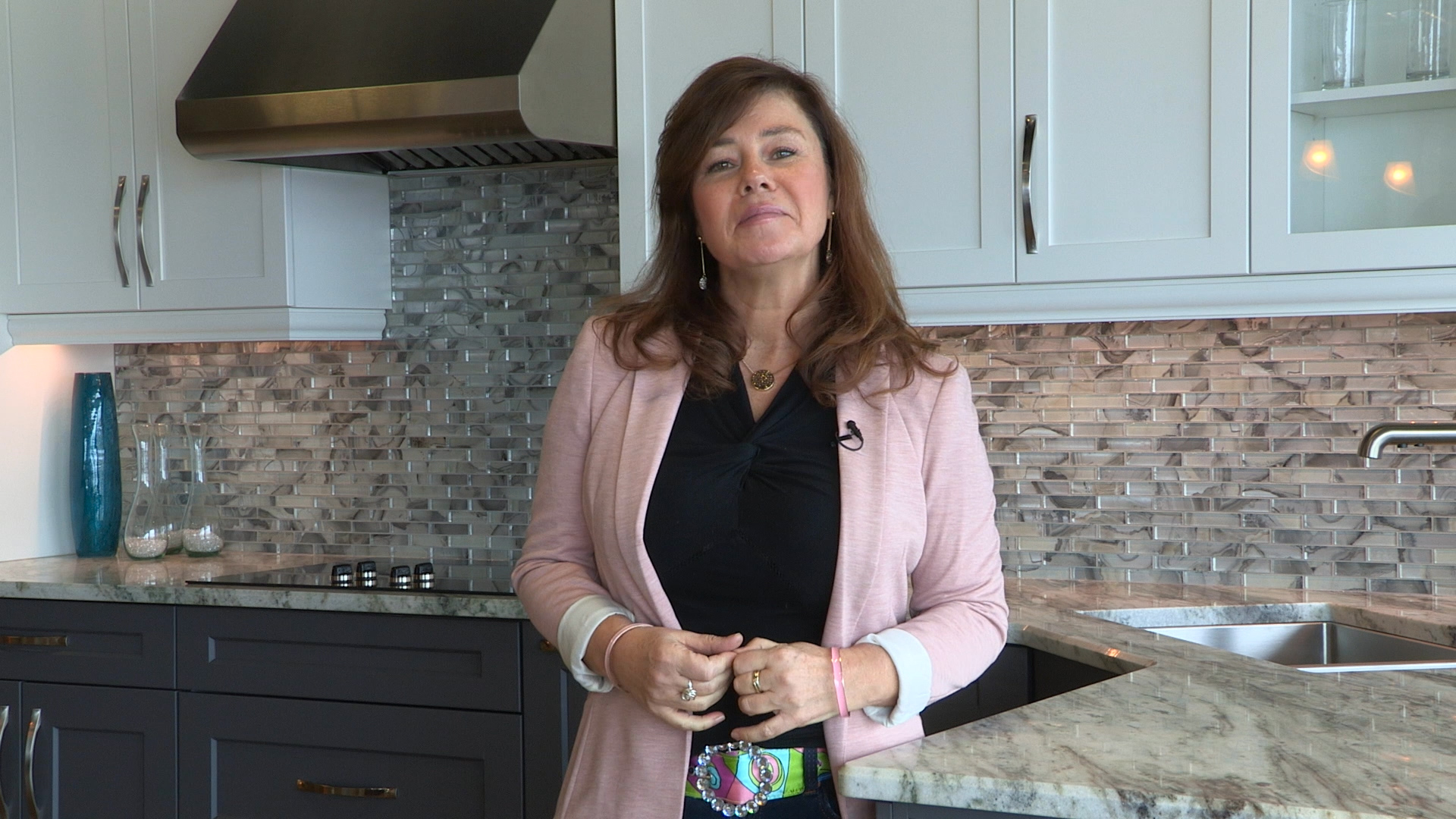
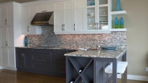
Michelle Cook shares some of her favourite kitchen features, inspired by a stunning kitchen by Sutcliffe Kitchens!
1. Grey base cabinets. Use of grey is a great way to break up an all white kitchen and bring an air of masculinity to the space, as well as a real grounded visual presence.
2. When it comes to countertops, granite is always an appealing and classic choice. It used to be that you would pick your slab, you’d fall in love with it, and not really know what the end result was going to be until it showed up in your kitchen. With today’s technology, computers are able to take a picture of the slab, in combination with the layout that you want, and the computer will tell them where it’s best to put a seam and how best to use the material in the most efficient way.

3. Morphing on your counters is a beautiful feature. Morphing is a nice way to hide the seams between slabs.
4. Sink placement is another area where you should try to be creative if possible. Angle your sink if you’re layout allows, and perhaps give yourself more counter space. This is also more visually interesting.
5. Getting all the colours in your kitchen to work together can be really challenging. Apply the rule of three. If your backsplash, for instance, has a lot of movement and colour in it, just ensure those colours work well with the granite and keep the rest of your features neutral. This way, the number of colours isn’t overwhelming.
6. Don’t forget about special features! A well planned broom closet, for example, is functional, neat and keeps the broom and the mop, dustpan, et cetera all from being stuffed at the back of a closet.
 7. And finally, don’t be afraid to include features for purely aesthetic reasons. Functionality is great, but there’s also something to be said about your kitchen looking the way you want it to too.


